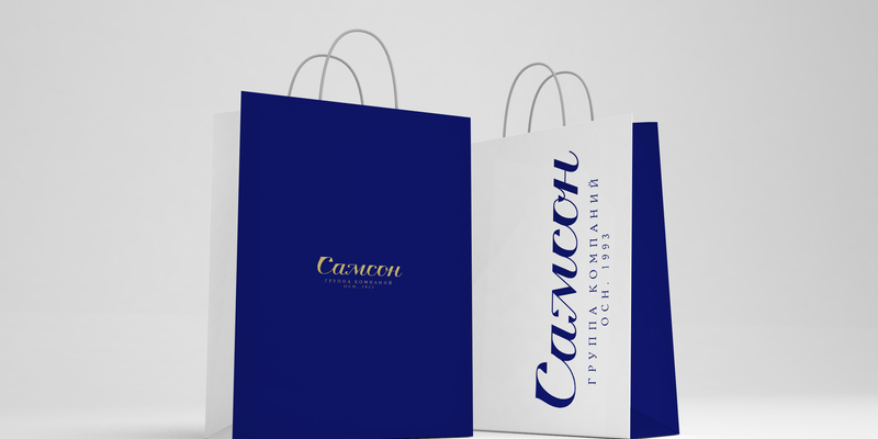
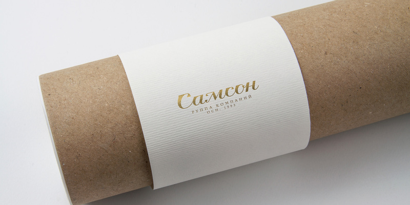
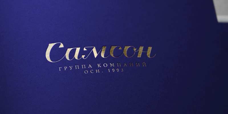
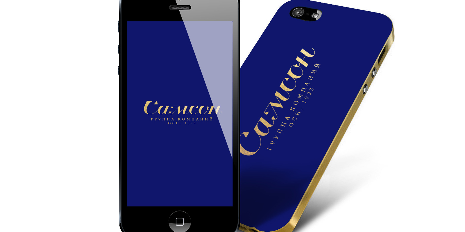
The new logo for the group of companies "Samson" (pharmacies "Samson-pharma" and etc)
The new logo for the group of companies "Samson" (pharmacies "Samson-pharma" and etc)
done | logo development and implementation
production | SHANDESIGN.PRO © 2016
NEW MINIMALISM. LETTERING
Putting aside irrelevant. Neat sign - the name.
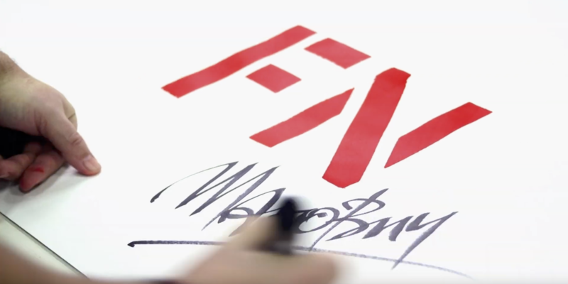
Technics | lettering based on calligraphy
Meaning | the name is transforming into original sign of quality, facsimile
Character | manmade, personified - the man is the main focus, his name, which serves as a guarantee of quality of everything the company does
Key message | "Everything that is made by the company is for people. This is our mission. And it joins all the spheres"
Customer | the company "Samson" is on the market since 1993
Chain of pharmacies "Samson-Pharma"
Flower shop "Samson-bouquet"
Medical centre "Samson - Med"
Guinea fowl farming in Kaluzhskaya region
La Ferme Cafe